
For the past year or so Briefbox have been proudly working with international design school, Shillington to produce guest articles and resources for their community of students and Shillumni (Shillington alumni, obviously!). We’ve shared our top tips of the industry for upcoming designers and we work closely with many of their students who use Briefbox alongside their course too.
Students at Shillington enrol in either 3 or 9 month courses, full or part-time respectively. The courses are designed to be fast and intensive to help prepare for the working world. We see so many fantastic designs produced all the time and this is testament to Shillington’s teaching style. Many graduates start working for major brands, pioneer their own businesses or find employment in top design studios. You can see some of their most recent works alongside some really helpful posts on their blog.
One area we see a lot of discomfort with from our own students is custom typography. As a student and even a design professional, if you’re not used to working in an area of design that’s not your speciality it can feel daunting to get into the correct mindset. We’ve noticed that a lot of you (yes, you!) hold back in areas you’re not very comfortable in, so we want to push those boundaries and encourage you to work in areas you’re not used to.
The following pieces have been designed by Shillington students. We’ve been so impressed with some of the recent works that we’ve seen and we wanted to share our favourites with the Briefbox community.
Marcus Parrot
Very similar to a couple of briefs on Briefbox, Marcus created an identity for a small, independent garden centre. He produced his own bespoke typeface and mocked it up into a business card as well as some other promotional material.


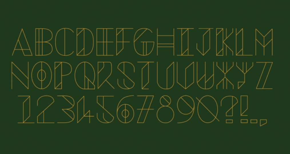
Biz Weegberg
Biz created an identity system for Beirut the capital of Lebanon. The brief was to reflect language, religion and cultural aspects of Beirut that fit together in a modular system. She took inspiration from all aspects of the culture to come up with this perfectly formed typeface. If you look at her website you can see the process she took and the inner workings of the typeface itself.


Georgina Keenan
Georgina’s typeface is a perfect example of originality and experimentation. If you’re not comfortable with using a pencil to sketch out your idea, see what other mediums you can use that will translate well for the overall design.


Daniel Kan
We love Daniel’s super detailed typeface. ‘Designed to be optimistic, nostalgic and dynamic’ it’s taken inspiration from the underground Metros. A great example of a lot of detail not being too overpowering but a clear and well thought out idea.


Inigo Ropner
As you all know, we love seeing your processes when you’ve submitted a design and Inigo shows his process perfectly in these shots from his sketch book. Just look at those layout lines, utter perfection with evenly spaced elements.


For more creative work by Shillington students, or to find out about the courses on offer, visit their website now.